

Problem / Needs
Customers want to see product recommendations based on visual similarity to products they like.
Hypothesis:
If we create a zone as a Product recommendation zone that can be fitted with More Like This recommendations
Then customers will be more inclined to interact with and purchase products recommended in recommendation zones
We will know if we are right if customer engagement increases with existing recommendation zones outfitted with More Like This recommendations
Resulting in increased Product Detail Page, ATB % and RPS
Behavior KPI’s - Conversion rate (click %) for products in Product detail page recommendation zone, ATB rate %
Financial KPI’s - Revenue Per Session

Competitors (Nordstrom / Bloomingdales)
Based on competitors analysis, UX suggestions were
Alignment of panel, top and right
Inactive upper Chevron already slated For removal post-holiday
Consider reducing thumbnail details to brand and final price to reveal More PROS items before scroll
Consider price type after pricing


Price / Promo badge tag

Price Tiers test
The center design is the Best
Desktop
+0.4 ATB Conversion
MEW
+2.6% Conversion
+3.6% Rev per Session
The third design showed +0.3 ATB Conversion but it had -2.3% Conversion and -3.7 Rev per Session View data

With Offer vs No with Offer
The best design is the second one.
No with offer tag decreased -11.6% in Rev per Session over Control
What I changed?
Remove heart Icon, review star
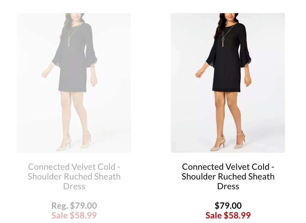
Have 2 tier price tag to reflect the lowest price if there is a promotion (Reg. , With Offer)
Remove the carousel ( engagement is low after 3rd product)
Alignment of panel, top and right (Margin, Padding)

Click the photo to view the each specs!

Redesign

Current Design