

Above the folder
Objective: To evaluate various mobile search experiences that bring products higher up the fold while aligning information and functionality most valuable to users.
Goals: Test different design executions incorporating key features and information, including BOPS/Same Day, Feature Facet Values (FFV), Filters, Sort, and Search Query Check.
Client Macy’s
Software Adobe XD, After Effect, Invision
Team Director, Product Manager, Engineers, Designer, Researcher
Role
As an Associate Product Designer, I conducted competitor analysis, concept testing, and created motion graphics for tooltips.
Challenge
Minimize the height of the above-the-fold screen on mobile and design a simple, effective shopping journey that allows customers to browse and explore ideas efficiently.

Hands off with spec
Includes Zero search result, Cross linking (Bloomingdales), alt text (Get it fast message) - accessibility check!
Problem
When customers research or browse a specific item, having too much information before scrolling down the page can discourage them from continuing their shopping journey. Additionally, customers may feel overwhelmed by the amount of content.
Solution
The right theme should strike a balance between visual appeal and presenting the right amount of information so that customers can absorb it at a glance.
Scrolling comes with a higher interaction rate, and most customers (internet users) are so accustomed to it that they'll scroll without hesitation.
Use visual cues to encourage shoppers to scroll (e.g., toggle buttons, product photos, etc.) to reveal more product listings.


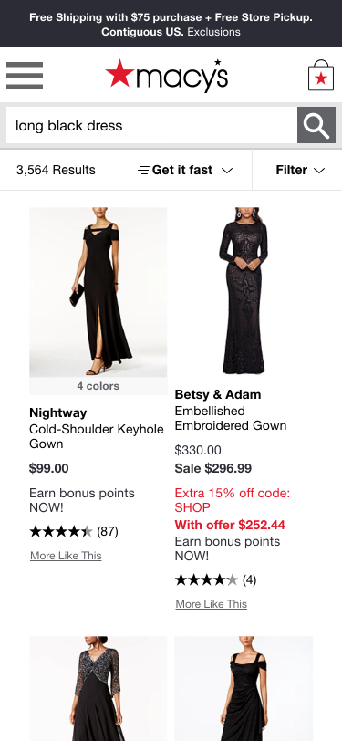
Current Design


The current Macy’s (Search & Browse) above-the-fold page displays a limited number of product photos. When customers click the sort-by submenu, the product listing does not update. Additionally, customers often get confused between the filter and sort-by features.
Minimize the height
Combined the Sort and Filter features and minimized the panel height to display multiple product listings on the Search & Browse screen. This allows users to view all options at a glance, creating a more seamless and intuitive experience.
Study

Above the Fold
The current Macy’s screen was the only one where customers did not mention the product.
Customer behavior indicates that they focus more on product images when shopping.
However, the search bar results were used to help recognize the product category.
1-Click Test
Clear CTAs and fewer choices help customers make accurate decisions quickly.
Across all tasks, No.5 Design (Amazon Killer) performed the best, with the lowest time on task and highest accuracy.
Variations of Macy's consistently performed poorly.
Detail Finding
Customers were able to recognize the product on the page from the search bar.
While the search bar was the primary component helping customers understand the intent of the page, the product itself was not highlighted, even though it is often the main driver of purchasing behavior.
For customers, scannability, filtering, and sorting are critical on the screen.
Customers who viewed the current Macy’s design did not mention anything about the product images.
“This is the Macy’s website. I know this because of the Macy’s logo at the top of the page. This page is trying to sell long black dresses. I know this because of the search bar text.”
Currently product listing only shows 6% at above the folder.


Sort & Filter
Toggle / Bold

Combined filter
Cursor / Bold

FFV Chips
Sort / Bold
No Chips / Bold
Personalization
e.g (Deliver to Elaine / Shop at San Francisco, etc.)
How can we provide a personalized experience for customers when they browse this page?
- Consider users as Known / Unknown (Personalization)
- Allow users to choose how they’d like to shop on this page
- Provide options for pickup or delivery
Alt Text
Regarding alt text and button labeling, I still agree with the previous recommendation that wording like “click here” or “tap here” should be avoided.
The button text should simply read “Consolidated options”
It is inherently understood that a link or button is activated by clicking or tapping.
Additionally, not every user will be clicking or tapping; the action depends on the input device they are using.

Winner Alt Text


Zero Result (Search Item)

Current Design

RED - total results / Insert Michael

Insert Michael / google version

Black / result sentence on top
Special Use Case: Cross Linking

Current Design

Test Design
Hands off
I supported the senior designer by conducting competitor analysis and concept testing. The quickest, easiest, and most effective approach was competitor analysis. Through this, I was able to understand current UX trends in the e-commerce industry.


Zero result