
1Hour design challenge
I was given one hour to identify users’ pain points while browsing the main page.
The challenge stemmed from the current design, which presents an online program introduction for businesses. Users often want specific information, but every button leads to a page describing the entire program. As a result, tasks become time-consuming and unnecessarily prolonged, requiring users to navigate back and forth repeatedly.
-
Creating Mobile-First Design
Most users access the online personal training program and related information via mobile devices. Designing with a mobile-first approach allows us to prioritize the most important content and create a streamlined, user-friendly experience. -
Research
Started the research process, which included analyzing customer behavior, evaluating current market strategies, and identifying existing user pain points.Design & Ideation
Conducted user interviews to explore ideas, identified potential solutions, and created wireframes, user flows, and an information architecture (IA) map.Testing
Finalized the mockups, conducted user testing with prototypes, and began iterating based on feedback.

Research


Interviewee
Seungju Lee - Online personal training experienced
Katie - UX designer at health care
Year
2021/12


Seungju Lee (Online personal training experienced)
“I could see the what does the website and company do, however I didn’t feel like joining the membership because the website only focused on the information.””
Katie (UX designer)
“Returning rate is a key metric for the online program, reflecting how users engage with both new and existing customers. Users often struggle to find information because there are too many CTA buttons. Additionally, the mobile design offers very limited space to display content, and users do not want to read all the information on a single page.”
-Focused on the conversion rate
-
Starting research
Given the limited time, I took a rapid approach by analyzing the current branding and website designs, breaking them down into their fundamental elements based on assumptions.
This allowed me to evaluate each UI and functional component, understanding its purpose and assessing how much value it provides to the user.
-
Build it.
Applying an evidence-based methodology that involves users throughout the design process enables me to create solutions that are intuitive and easy to understand.
-
Grow it.
To improve conversion rates for both new and existing users, it is important to identify key points that encourage users to revisit the website.
Return Rate
Based on my research, a returning customer rate of 30%–50% is generally considered good.
During user research, I found that people often visit the online personal training program without prior planning. One user mentioned that she looked up the online program because gym-based personal training was too expensive. This suggests that if there is a significant price difference between gym PT and online PT, users are more likely to consider the online program.
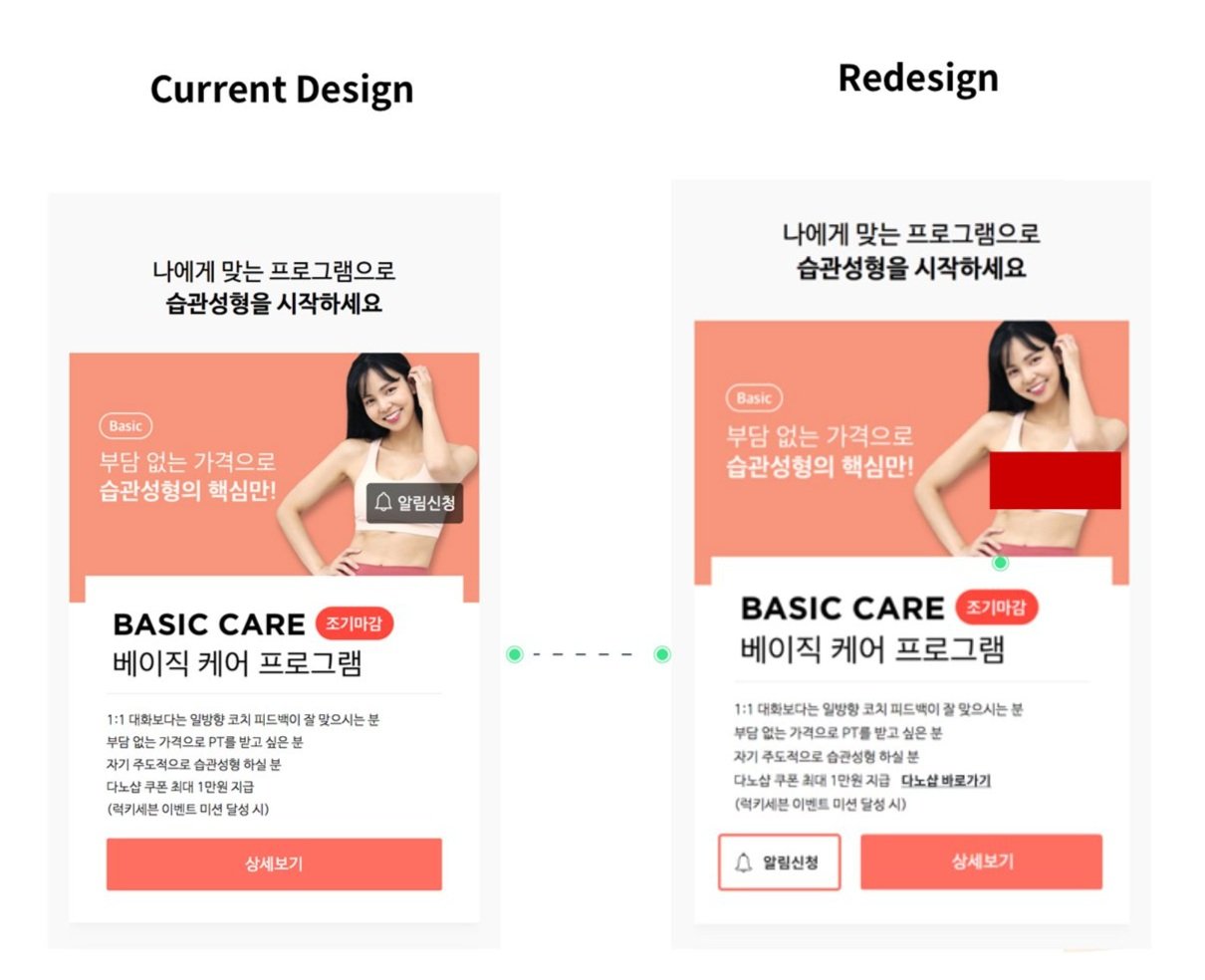
From the user interviews, I also discovered that users had difficulty noticing the alert CTA button. The current design emphasizes the detailed CTA button, which sometimes causes users to skip over information cards. Users feel pressured to click, expecting the next page to contain the membership sign-up section or repeating similar information with lots of content.
To address this, I added a secondary CTA button next to the main link. By allowing users to click the alert button, they can browse the website without pressure or interruption. This approach helps first-time, unplanned users access information more comfortably and increases the likelihood that they will return to the page.

Make it short
By consolidating reviews and reducing the clutter of overlapping information on the main page, we created space to display program details alongside reviews, allowing users to see both at a glance.
In the current design, all CTAs lead to the same page, which frustrates users who expect each section to provide different information. By combining reviews and program details on a single view, users can access relevant information more efficiently and with less confusion.