

Frequently Bought Together
Overall, by providing Frequently bought together's panel on the product detail page, the revenue increases over $110,000 and product view & click engagements total increase over 5%.
Client Macy’s
Year 2019
Type UX, Interaction
Overview
To enhance cross-selling opportunities and simplify the customer journey, I led the redesign of Macy’s Frequently Bought Together feature on the product detail page. The goal was to help customers easily discover and add complementary items to their cart, improving both convenience and average order value.
Role
As the lead designer, I partnered with product managers, data analysts, and engineers to evolve the legacy design into a modern, intuitive shopping component. My key contributions included: Redefining user flows to support seamless multi-item selection and checkout Refreshing the visual design to align with Macy’s updated digital brand standards Conducting quick usability validation with internal stakeholders to optimize clarity and conversion
.Outcome
The redesigned experience drove measurable impact:
+$110K in additional revenue generated
+5% total increase in product views and click engagements


The Challenge
🧩
The initial version of the feature was developed strictly based on business requirements. At launch, the Frequently Bought Together panel only appeared on product detail pages for items with a single option.
However, this limitation created a fragmented experience. Customers browsing products with multiple options — such as size, color, or style variants — could not see any cross-selling recommendations. As a result, they had to navigate back and forth between pages to explore complementary products, making the shopping journey confusing, time-consuming, and less engaging.
This usability gap clearly signaled the need to expand functionality and simplify interactions to better support complex product types while maintaining design consistency across Macy’s catalog.
Solution
💡 To address these challenges, I applied an evidence-based design methodology that actively involved users throughout the process. Through iterative research, prototyping, and validation, we identified key interaction patterns that allowed customers to easily understand recommendations and add complementary products — all without interrupting their shopping flow. This approach ensured the redesigned feature was both intuitive and conversion-driven, aligning user needs with business goals.

🎯 Understanding the Business Goals
The first step in the process was to identify which metrics would have the greatest impact on the company’s bottom line. I collaborated closely with business stakeholders to align on key success indicators and understand how the new feature could drive measurable value for both the customer and the business.
Through stakeholder interviews and requirement workshops, I gathered insights on:
Core business metrics that define success (e.g., conversion rate, average order value, engagement)
Strategic business priorities the feature should support (e.g., cross-selling growth, seamless shopping experience)
Expected value of the new functionality from a business perspective
This early alignment ensured that every design decision later in the process was grounded in both user needs and business impact — creating a shared vision across teams.
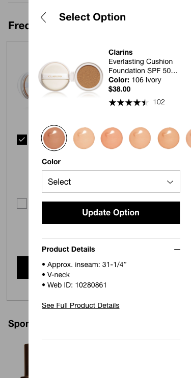
Current Design
The initial version of the Frequently Bought Together feature displayed a single recommendation per product detail page.
To comply with existing business logic, it excluded “Gift with Purchase” and “Purchase with Purchase” items, which limited the visibility of potential cross-sell opportunities.
Additionally, the feature only supported products with a single UPC (Universal Product Code).
This meant customers couldn’t change or select product options such as size or color.
Instead, Macy’s algorithm automatically displayed a default variation, often leading to mismatched or irrelevant product pairings.
As a result, while the design technically met the original business requirements, it offered a constrained and inconsistent user experience, reducing engagement and cross-selling effectiveness.

Target Audience
Macy’s primary target audience consists of women aged 30 to 50 who are fashion-conscious, trend-driven, and value both style and quality.
They are typically confident spenders who enjoy discovering new trends and expect a seamless, personalized shopping experience — whether online or in-store.
Understanding this audience was key to ensuring that the redesigned Frequently Bought Together experience not only aligned with their shopping behaviors but also encouraged product discovery in an effortless and inspiring way.


🧠 Quick Sketch & Team Discussion
During the early ideation phase, I created quick wireframes based on team discussions to explore how the feature could handle different product configurations.
Our focus was on how to present item option information clearly while maintaining a smooth shopping experience.
Key design questions we considered included:
How can we effectively present an item’s option information (e.g., color, size) within the recommendation panel?
What happens when an item has multiple selectable options — should customers be able to change them directly?
How do we handle cases with two different option types (e.g., Color and Size)?
What is the appropriate layout for items without any options?
These exploratory sketches helped the team visualize possible interaction models and identify which approach best balanced clarity, simplicity, and conversion efficiency.


Testing Results
Which "frequently bought together" item design best matches a customer’s mental model?
Senario: You are looking for [X item] and, while reading the product description, you notice the "frequently bought together" section.

Product Detail Page

Change the Recommendation's Option
- Customers want to see a simple description before changing the product’s option.
- Customers want recommendations if the suggested product is from the same brand or based on an algorithm.
- Customers who are familiar with the product can simply click the “Add to Bag” button; if not, they will want to view the product details.

The Method to Present the Gift
- Customers want to see the exact photo of the gifts.
- If there is more than one gift option, they may not be able to check all options.
- What if customers don’t want to add the gift?


Iterations
Throughout the iteration, I focused on designing a shopping experience where customers do not lose their journey. They have to scroll down to check the currently viewed product information. Customers mentioned that the panel’s positioning was confusing, so I minimized its height using a collapse feature. Based on customer feedback that they want to see the description, I implemented a simple description using a drawer element.
Throughout the redesign, we took a strategic approach to ensure our design solutions were more inclusive than competitors, while staying aligned with the information our customers expect from Macy's "frequently bought together" section.
Interaction explorations


Next Steps
The product has not yet reached the review stage and is still in the discovery phase. In the meantime, the next steps should include conducting additional usability testing to refine both the concept and the design. Collaboration with developers and other teams is essential to ensure a cohesive implementation of the design.
The goal is to incorporate more user-friendly and user-centered design elements to create the best possible shopping journey.
